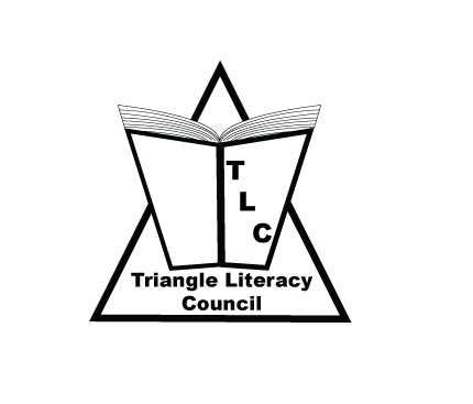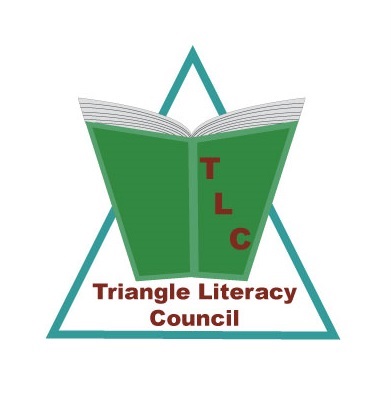
I created logo for Triangle Literacy Coincil for this assignment. I used techiques I learned from this lesson where I have learned how to group elements, how to change color, etc.
For this logo, I created a book into the triangle, and triangle literacy council name and its abbreviature.
Also I tried to avoid common logo design mistakes such as:
1. Don’t use too many fonts or weights (two maximum)
2. Simple logos are more memorable
3. Don’t use drop
shadows, embossing, or other layer styles to gloss up logos.
Full article is here
Also, I have this black and white logo for contrast and customers can pick their own colors for this logo.